SalesForce based CRM Application
An improved CRM experience for the tele-operators through restructuring and redesigning the entire application to smoothen out the various tasks and processes and reduce the stress and time required to complete them.
To maintain the anonymity of client and users, I have omitted the visual designs and modified confidential information in this case study.
Problem
The current CRM application is cumbersome and outdated, resulting in a subpar experience on the user’s end. Operators are forced to use the application inspite of its inefficiencies and non intuitive task flows. The result is an experience that’s poor for operators resulting in more time taken to complete a task for a client call.
Vision
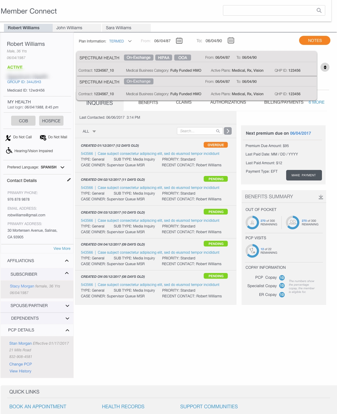
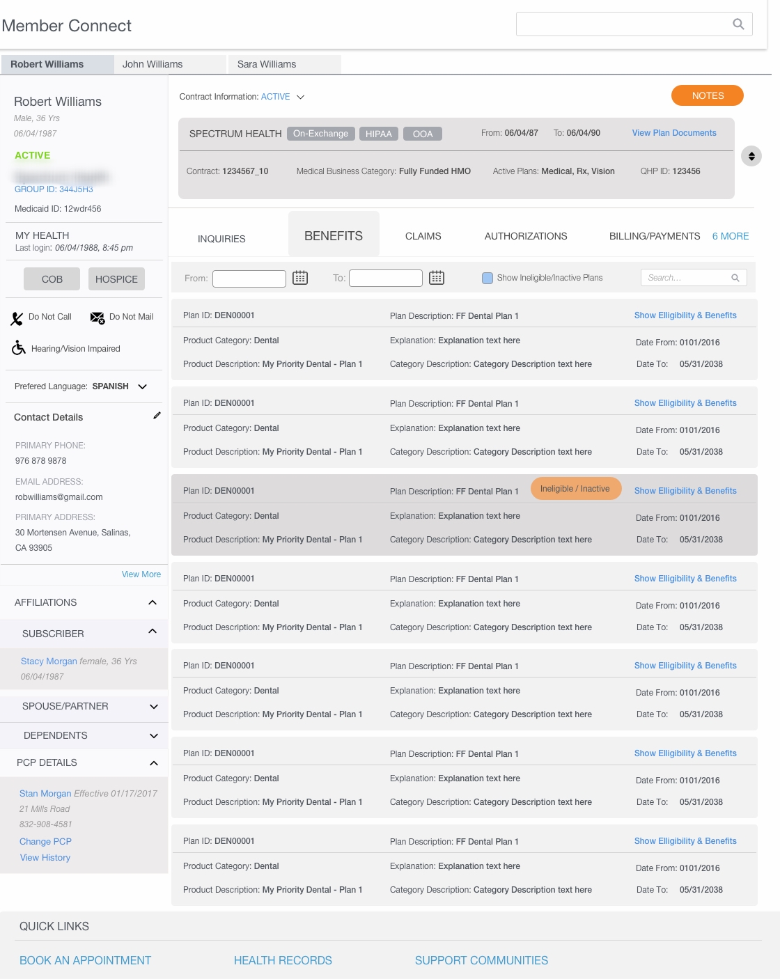
The Client approached us to improve the overall experience to address the issues of time wastage, reduced efficiency and more clarity on the customers profile allowing the operator to visualize the status, products purchased in order to give them the right information sooner. Our client wanted to develop the new design as a custom UI over salesforce framework. Key components to redesign included Member Konnect, Provide Konnect, Authorizations, Agent Management, Claims, Billing & Payments, Employer Group/Sub-group.
My Role
I was part of a large product development team and was solely responsible for the experience strategy and design of the webapp. I led the UX, UI and visual design effort, produced and co-presented all major design deliverables to our client between for 4 months in a series of planned sprints. I worked very closely with the business lead and product manager on capturing the requirements, and a senior developers on the iterative application development.
UX Design & Challenges
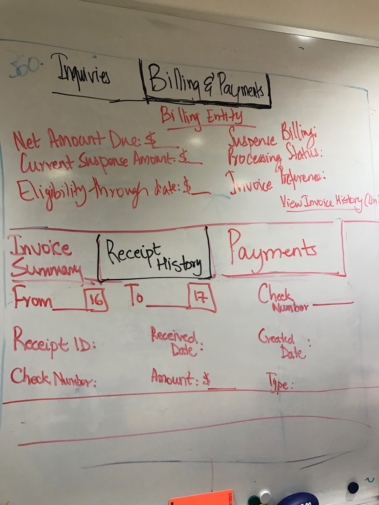
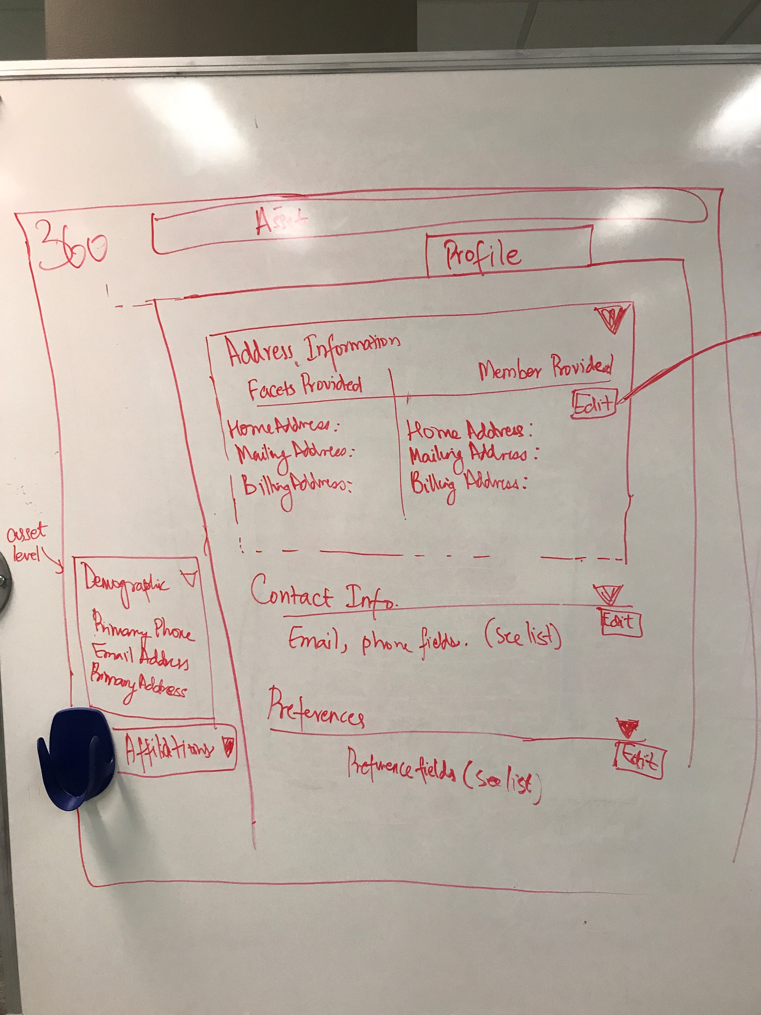
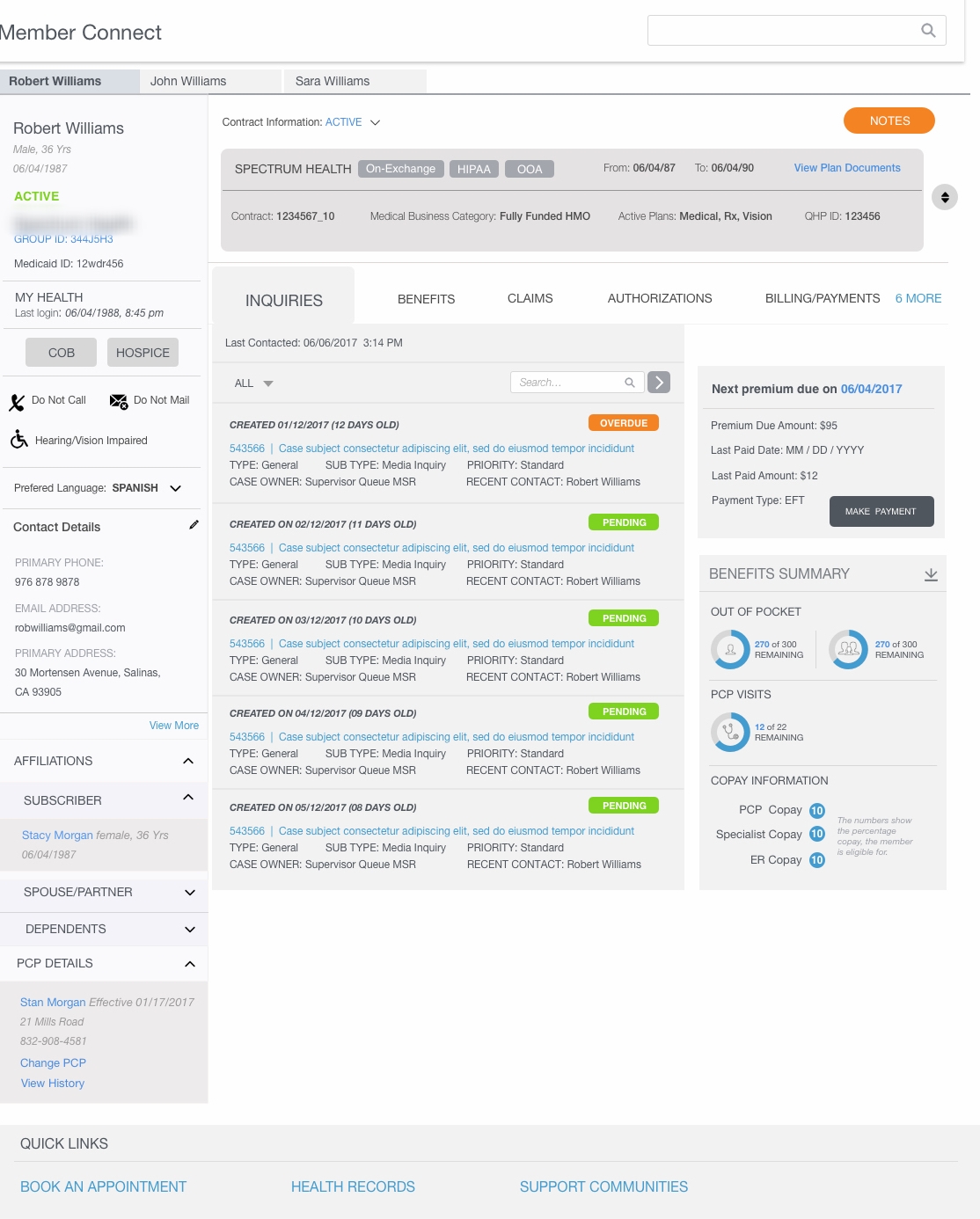
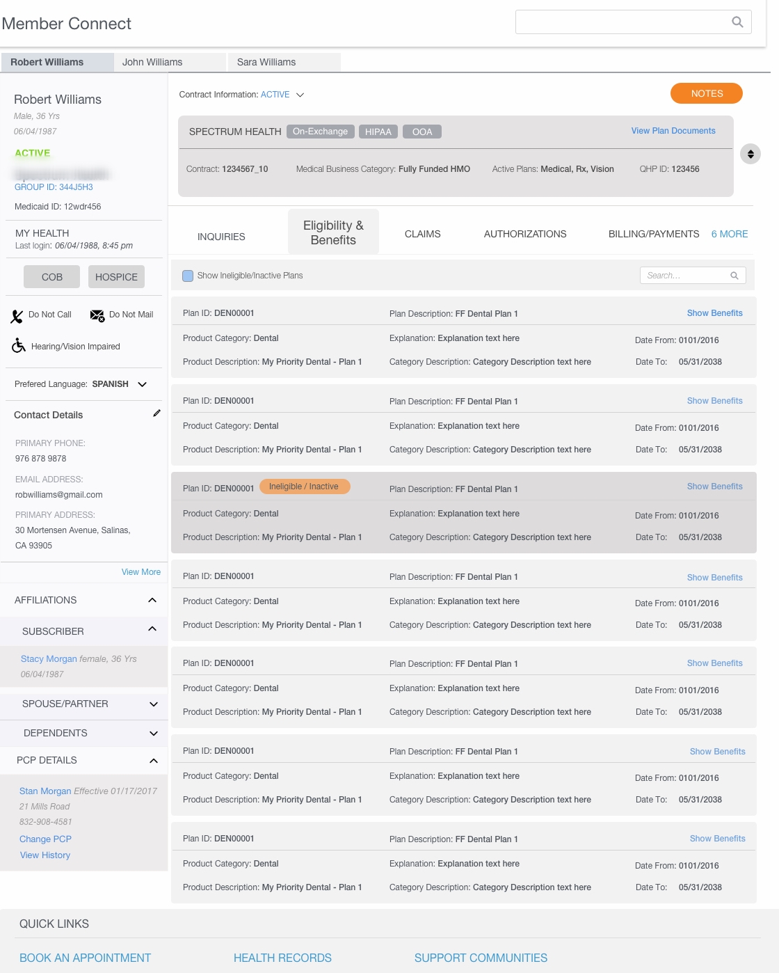
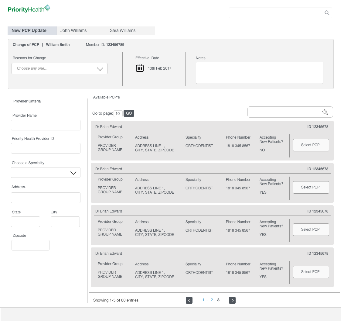
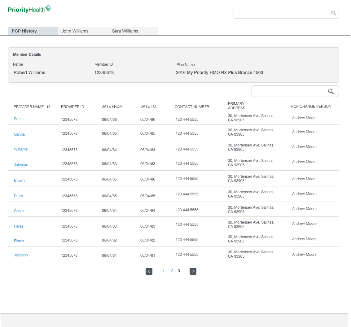
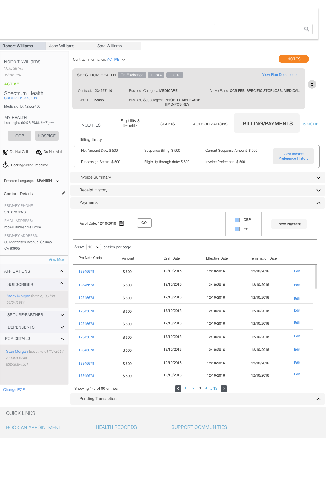
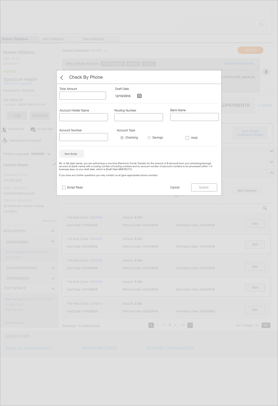
To validate the user flow and begin to design the user experience, I sketched out the various consumer/merchant screens and interactions. Paper mockups and role playing helped me iterate the design concepts quickly. I then quickly moved on to create high-fidelity mockups in Sketch, which I handed off to our development team. At the end of each sprint, I would demo the apps to our clients to make sure there are no issues in the user experience.
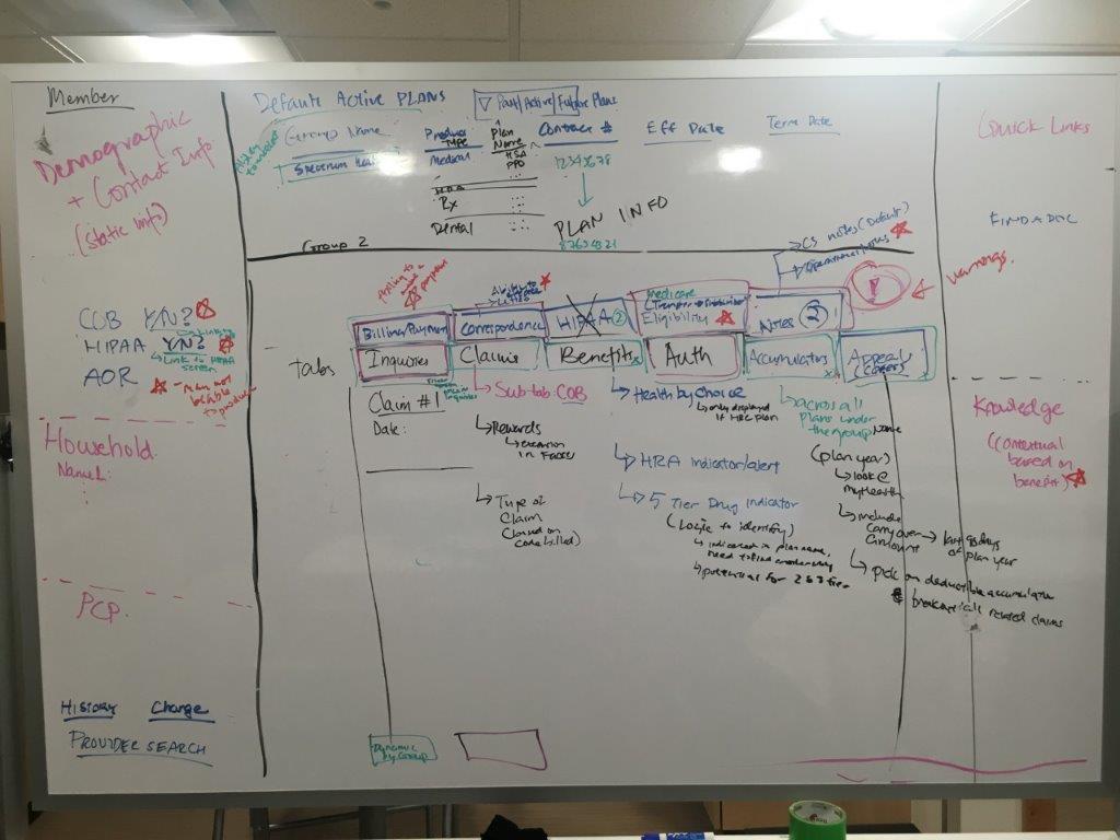
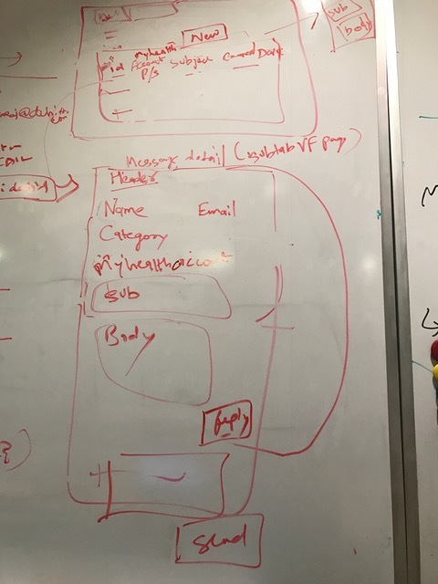
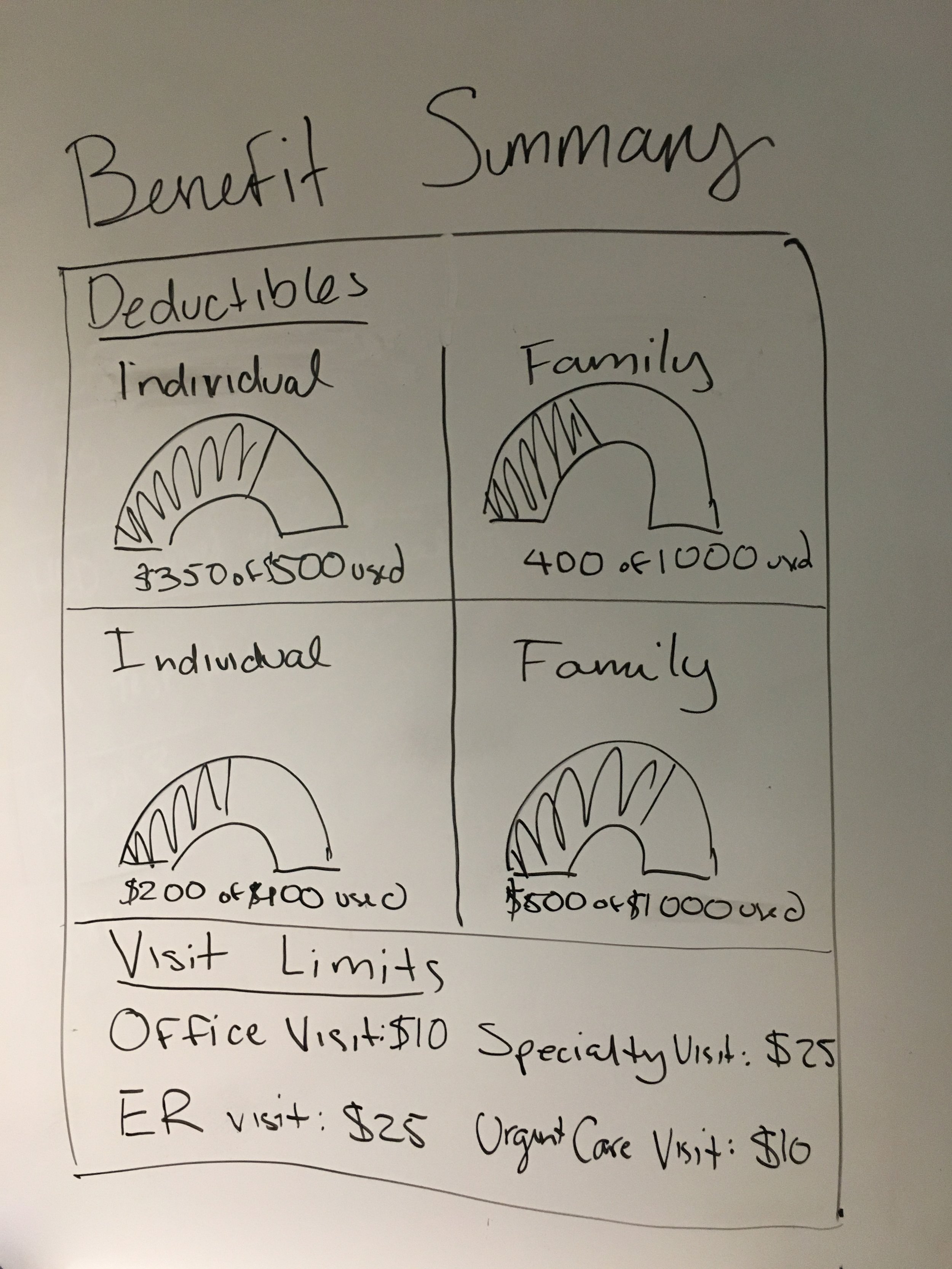
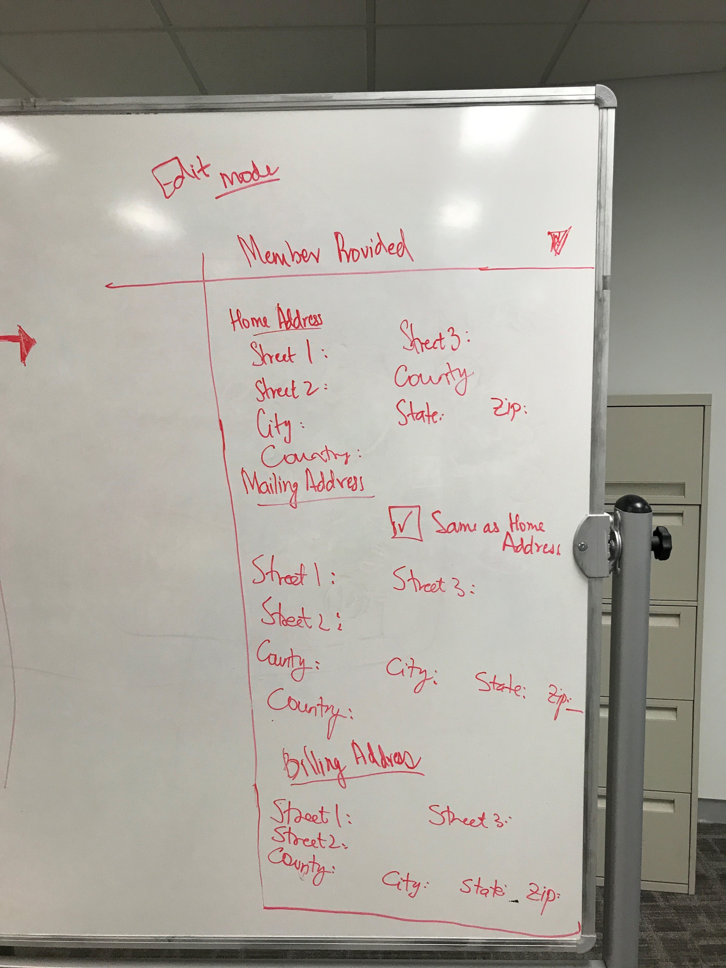
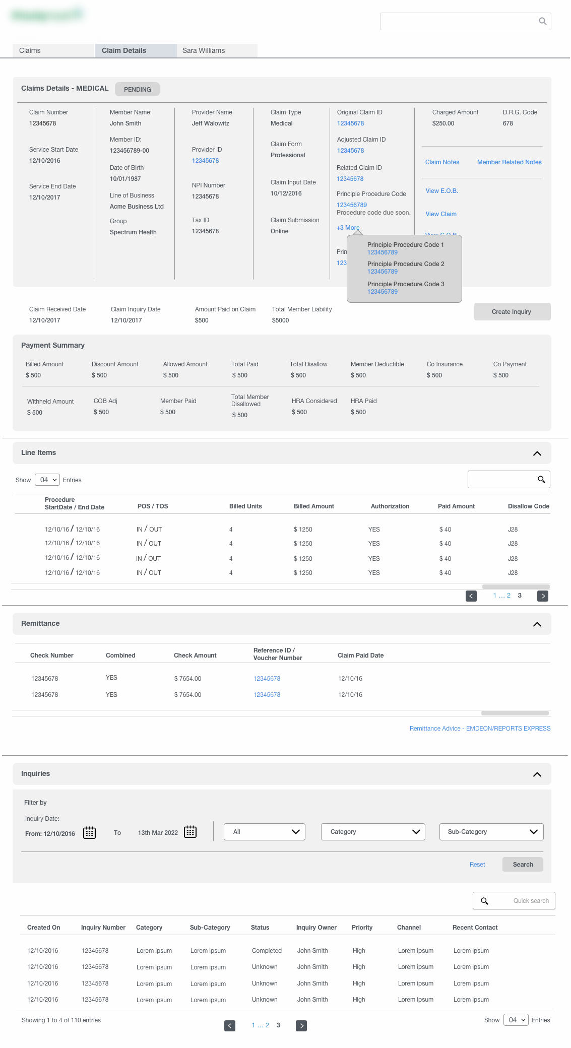
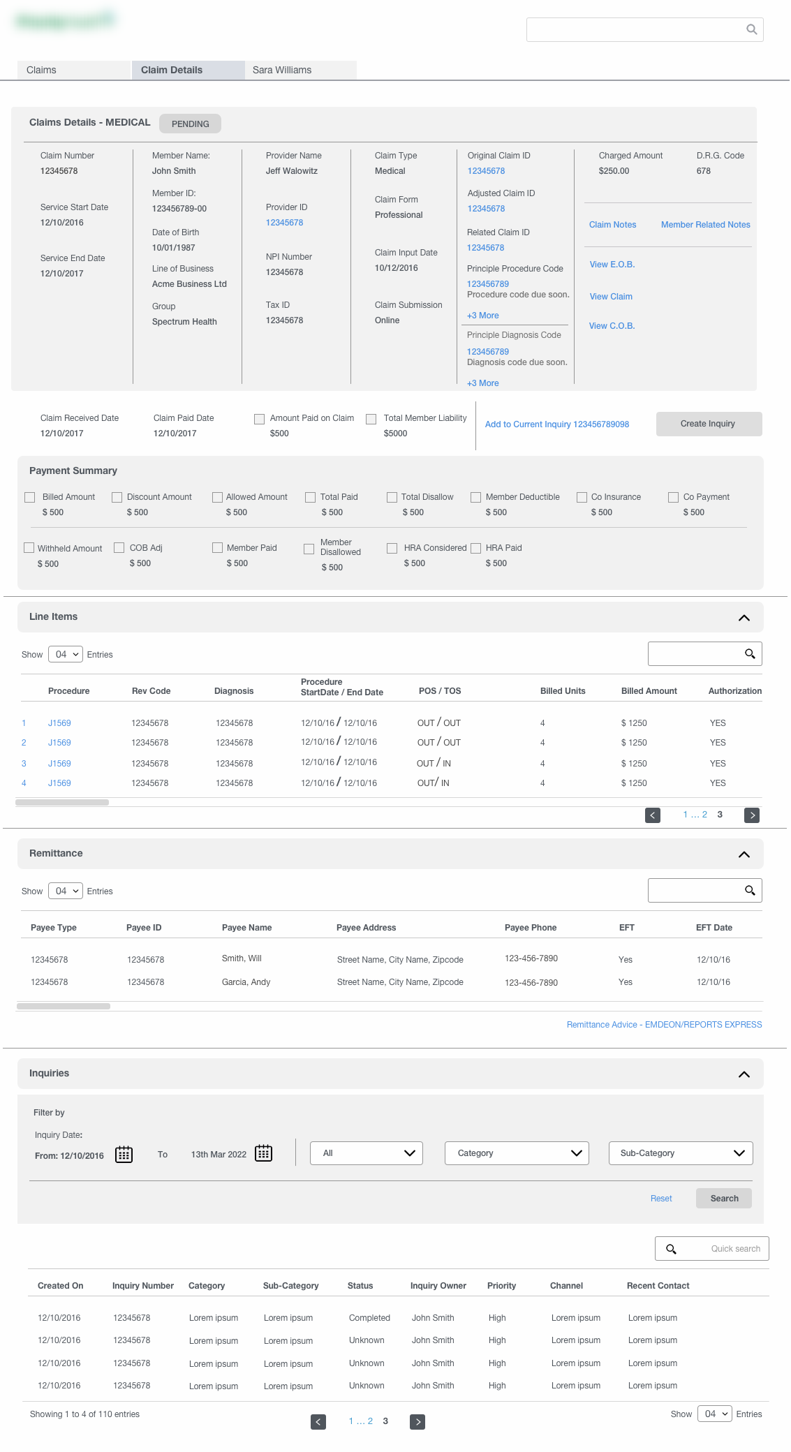
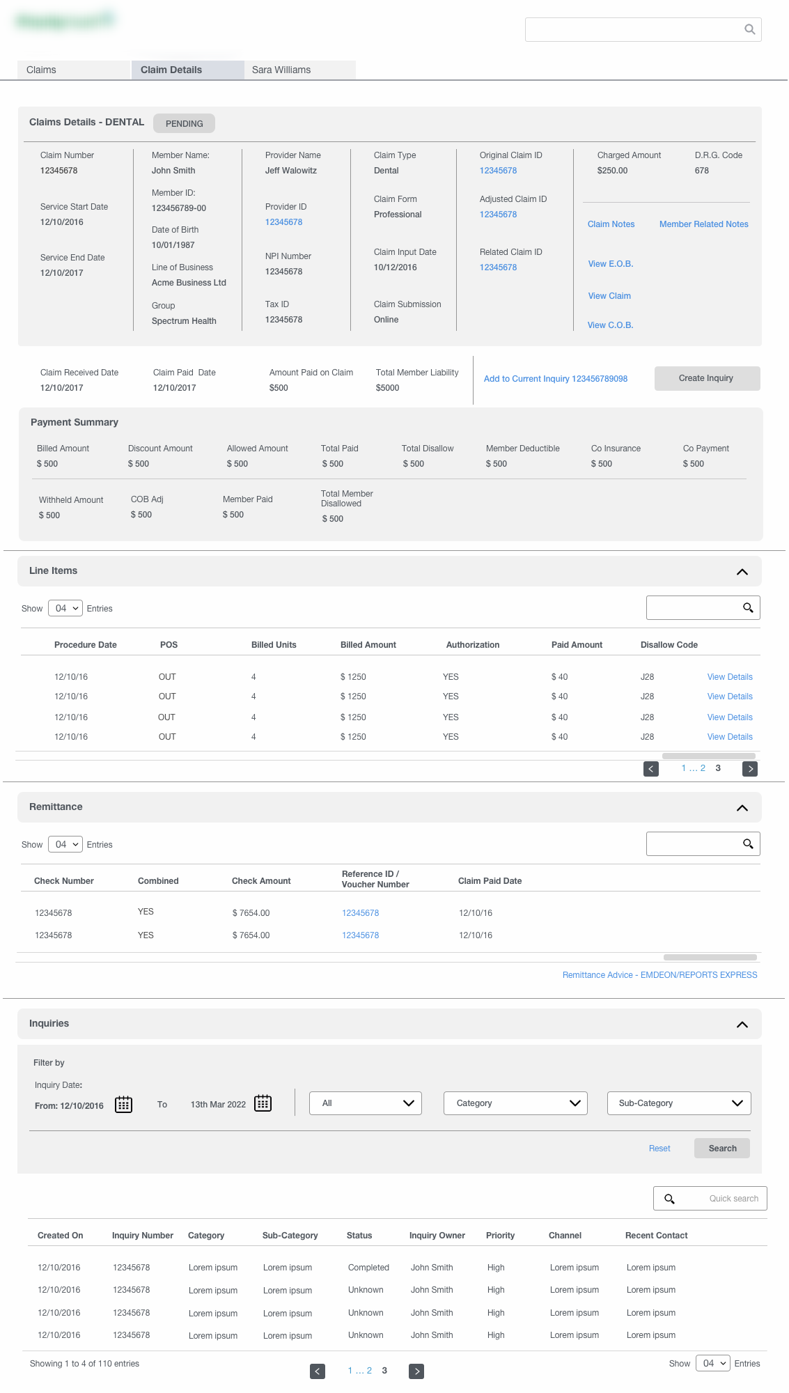
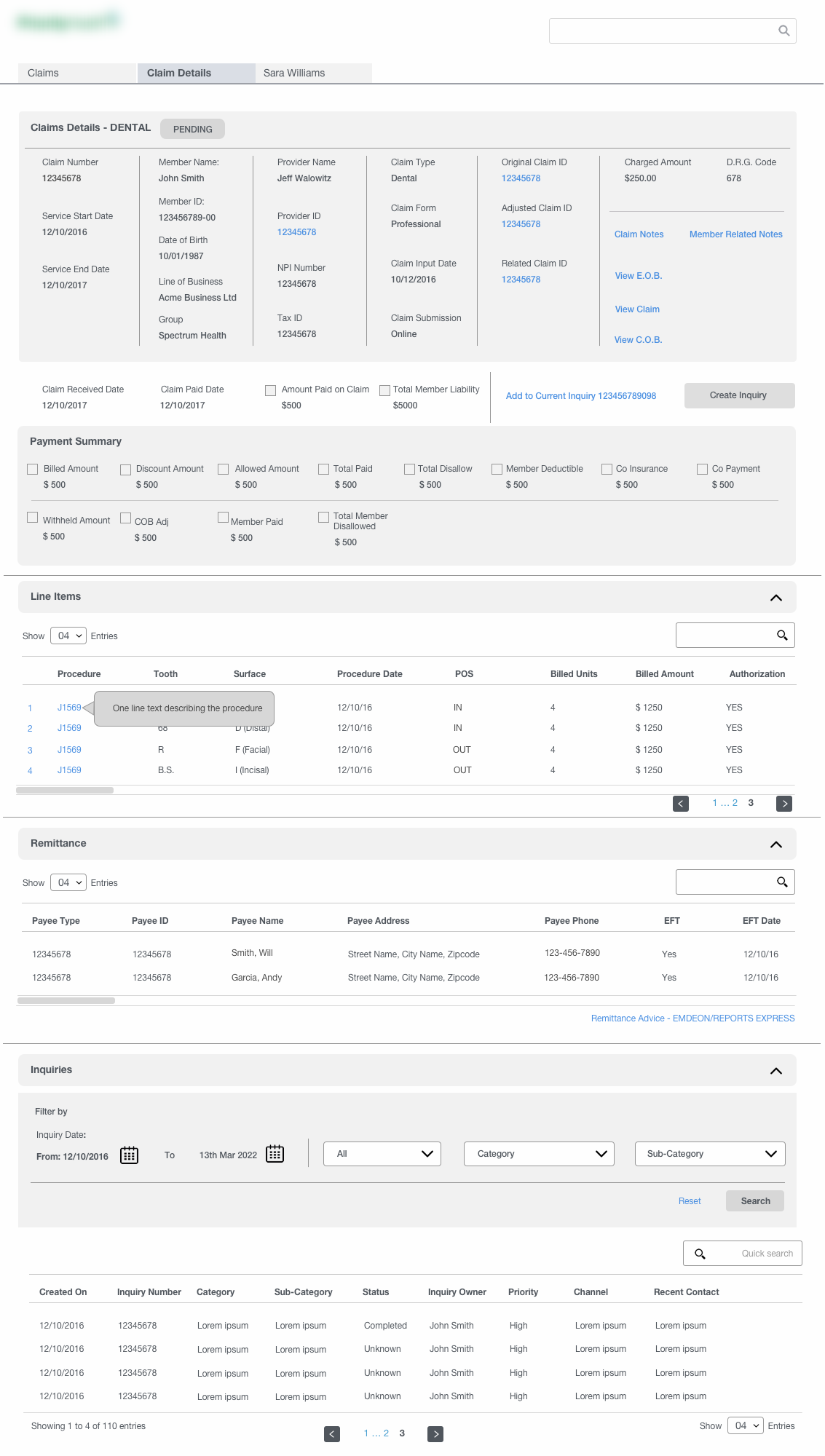
Since there was limited contact with actual users, the team had to rely upon the inputs and other usability data from the client itself. We initially began the design process with brainstorming and whiteboarding the different modules individually and come up with a rough sketch of how the concept will look like. We had multiple rounds of discussions over them with the clients in terms of features, information hierarchy, display of certain key sections, overall layout and other visual elements before producing the high fidelity wireframes. This method was adopted to optimize the limited project time and resource constraints which was one of the challenges.
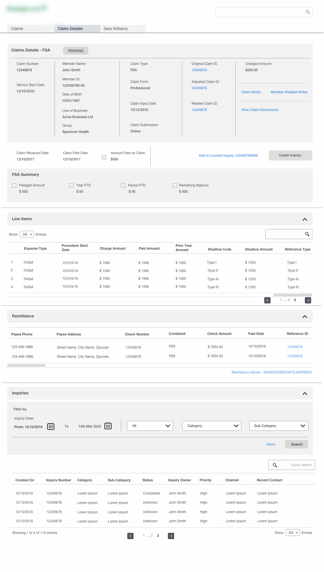
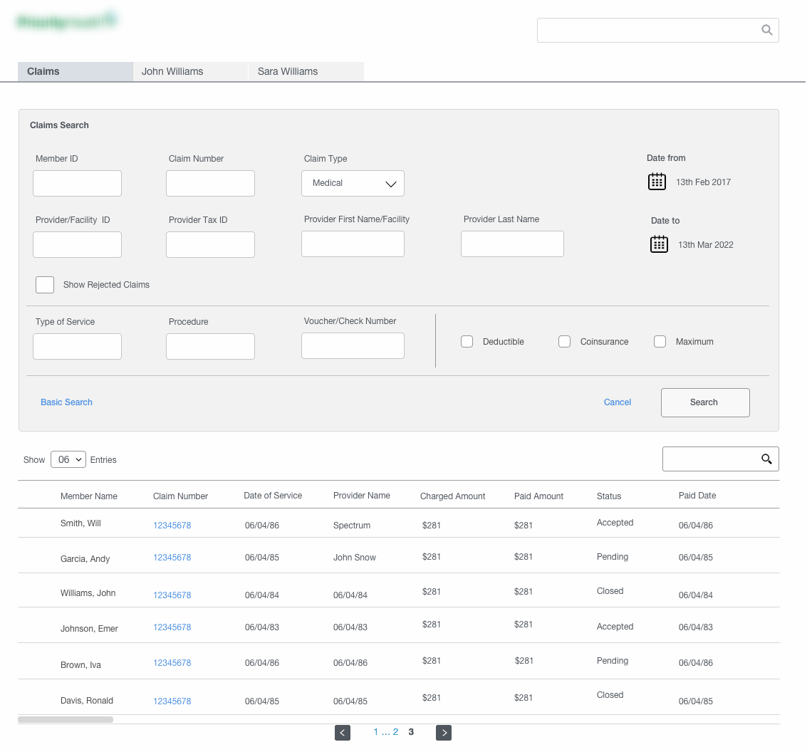
Wireframes for the different section for the Claims made and other historical records for a particular customer
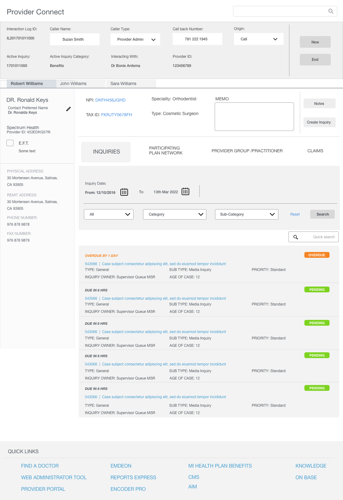
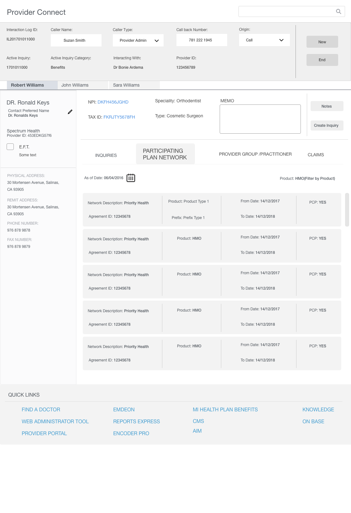
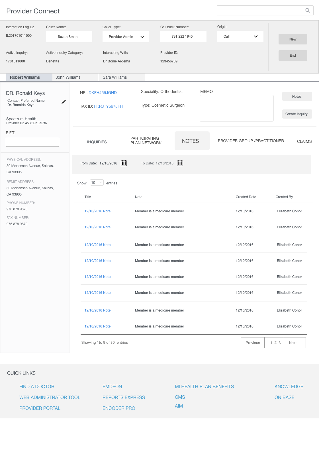
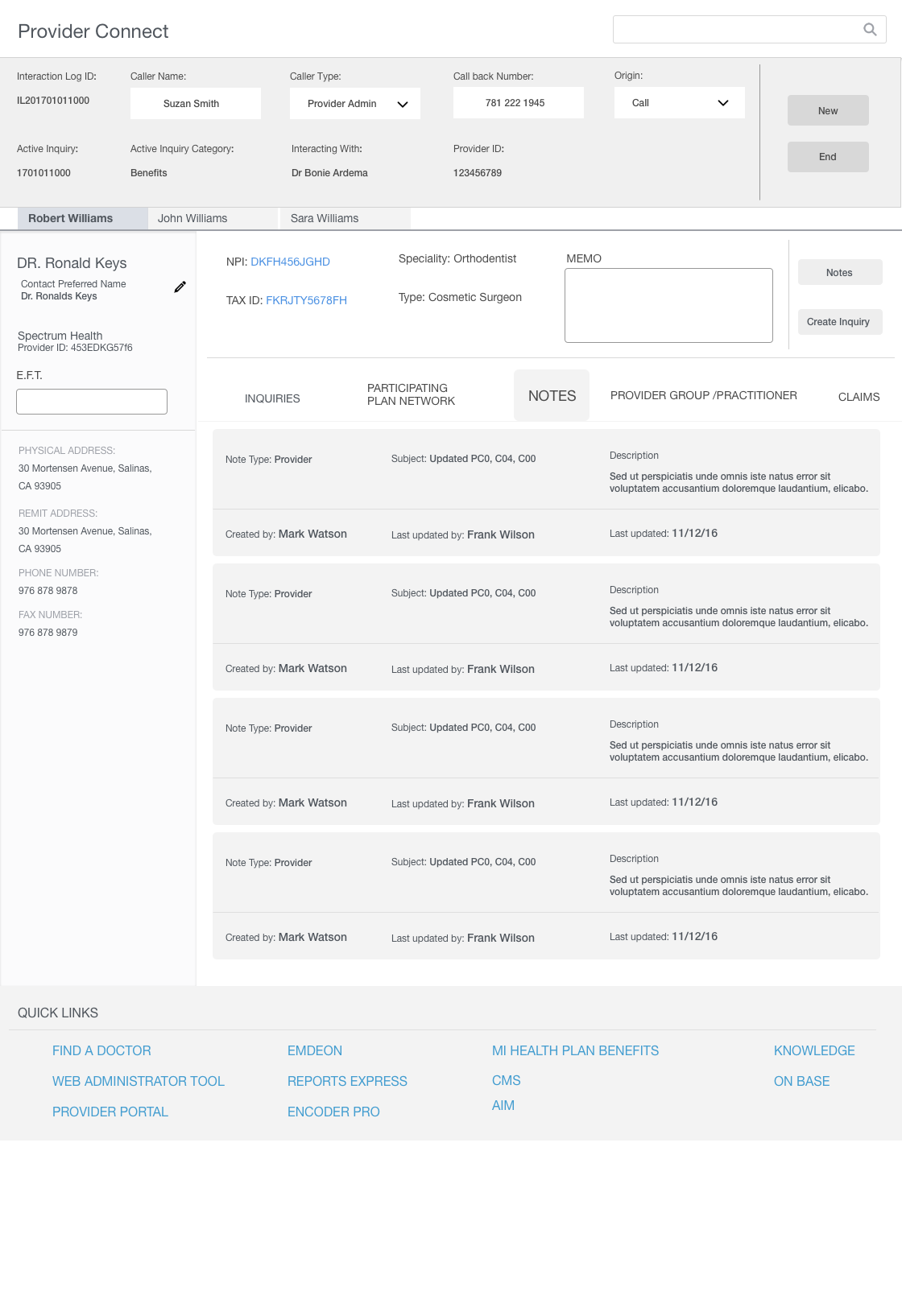
Wireframes for the Provider Konnect module showing the different sections
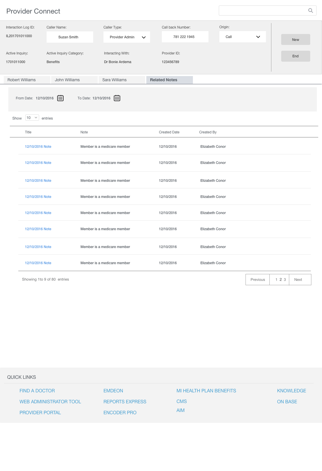
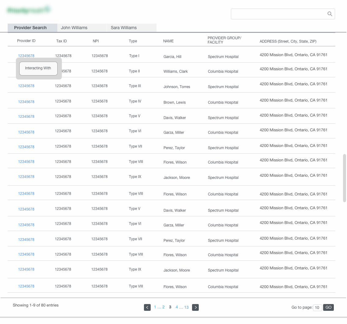
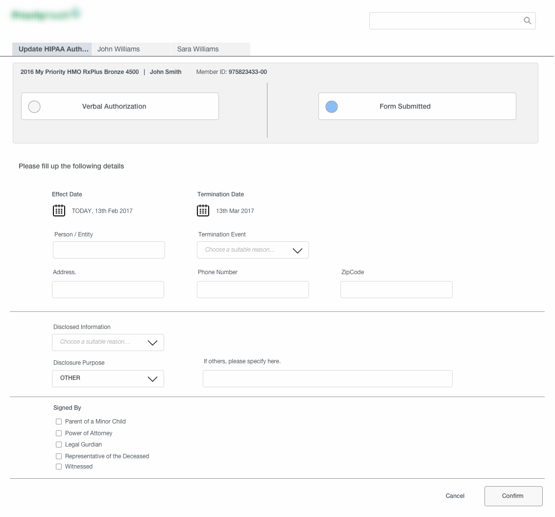
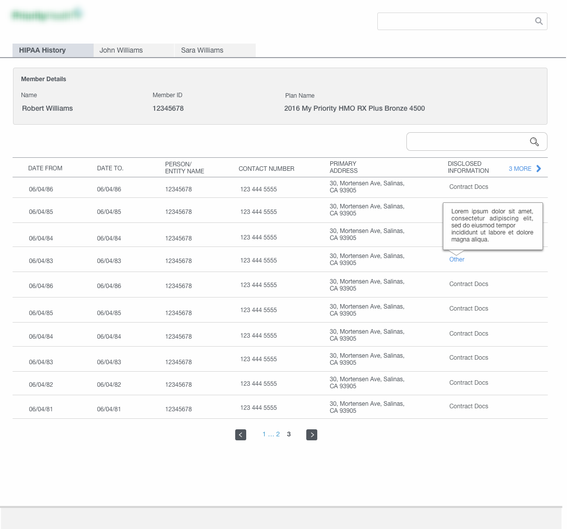
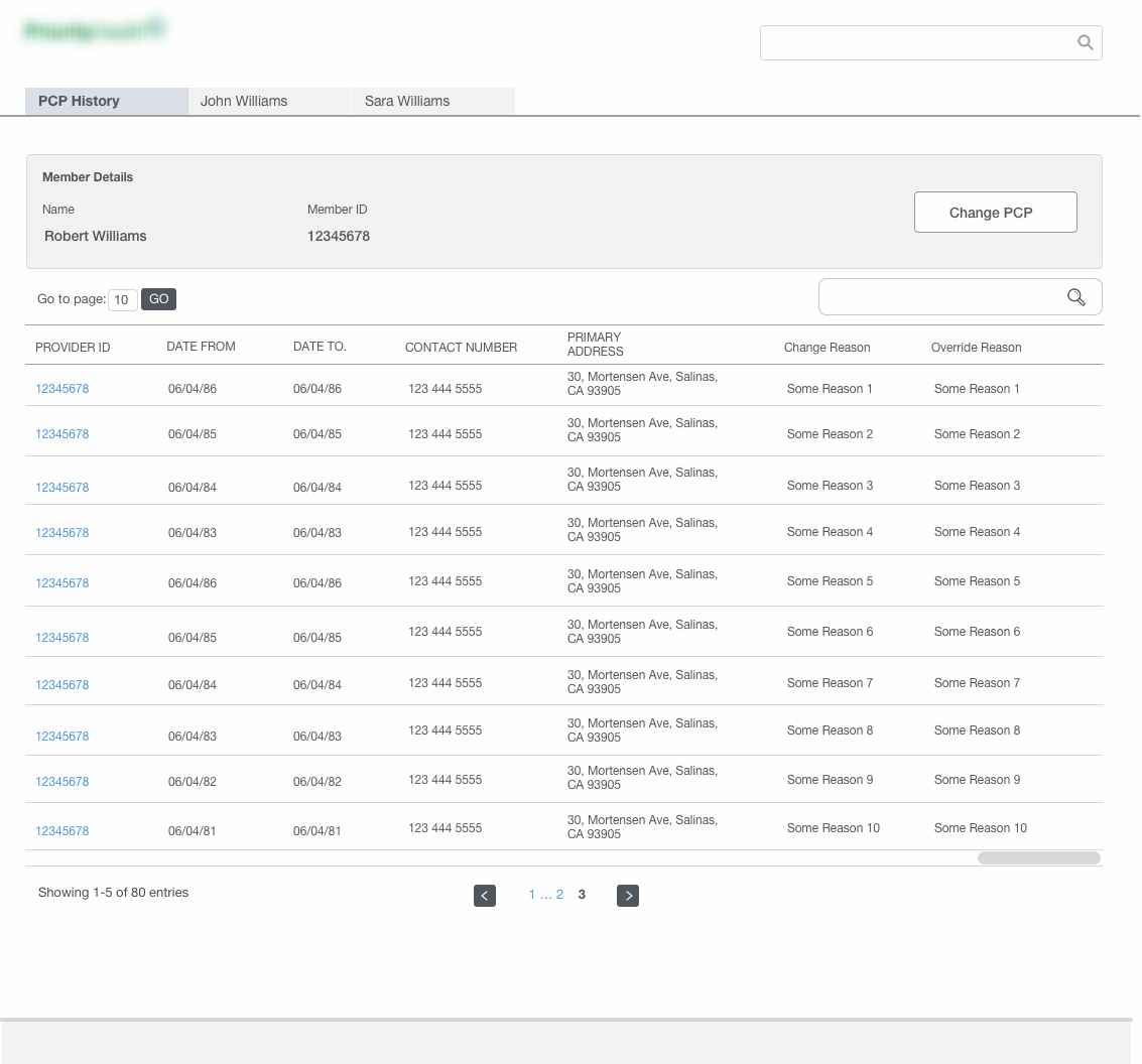
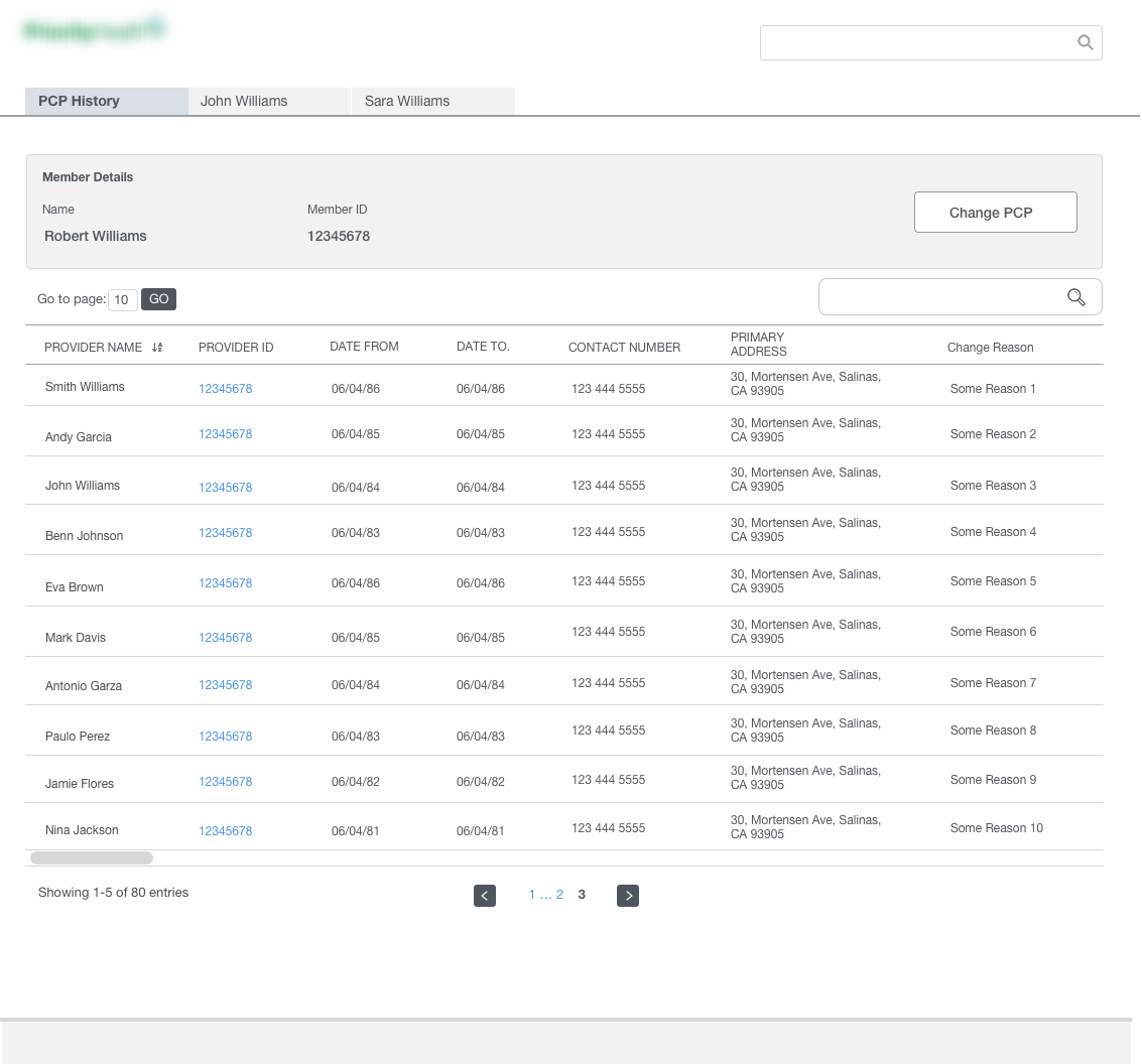
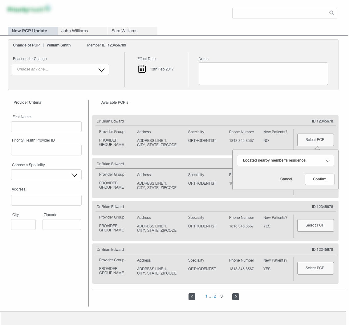
Wireframes for the PCP and HIPAA updates module
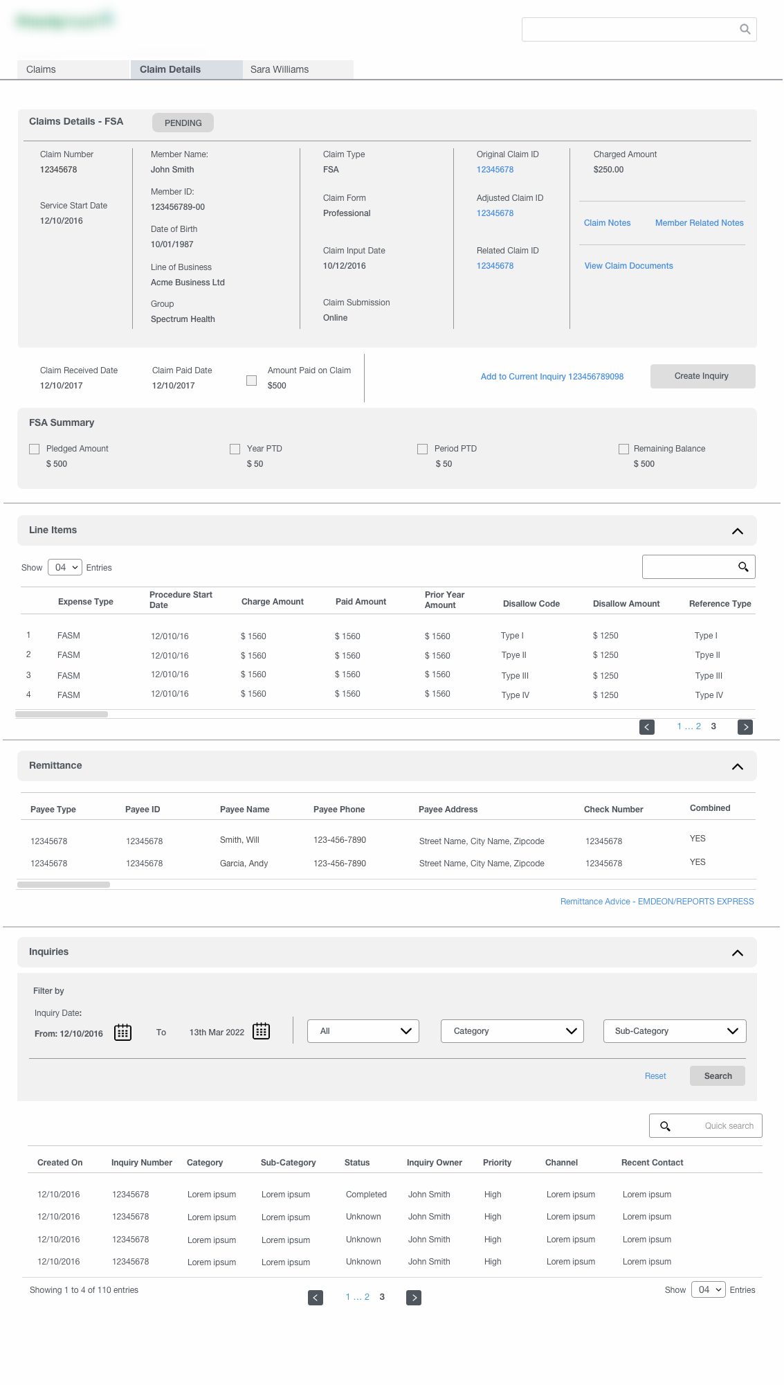
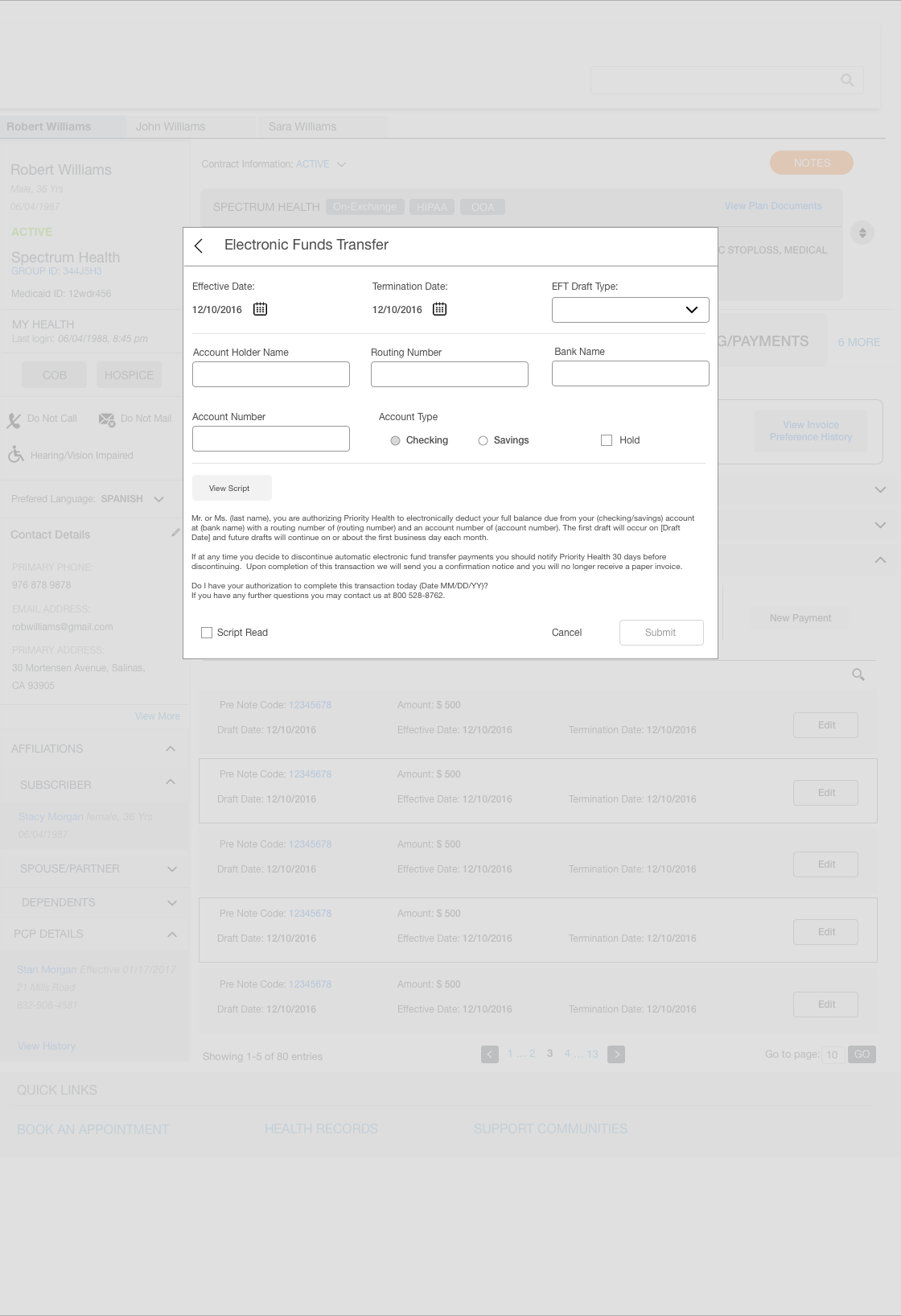
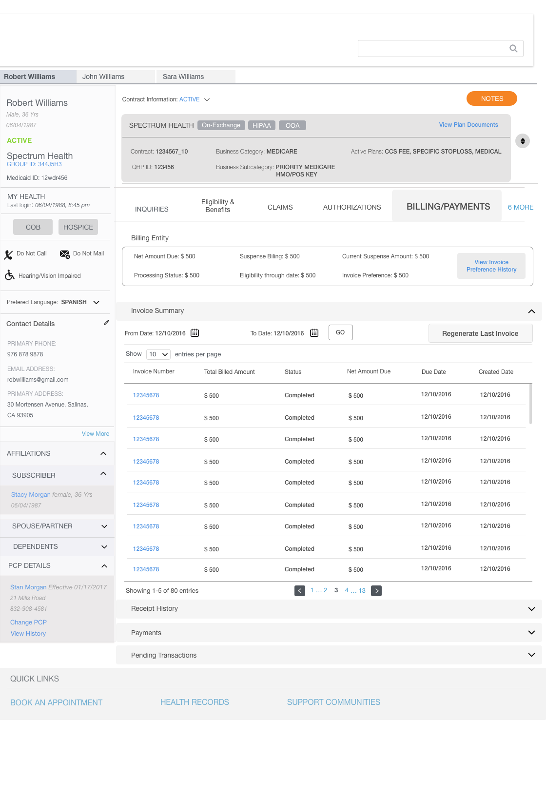
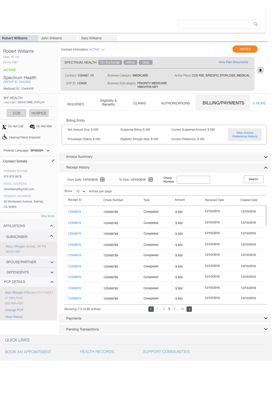
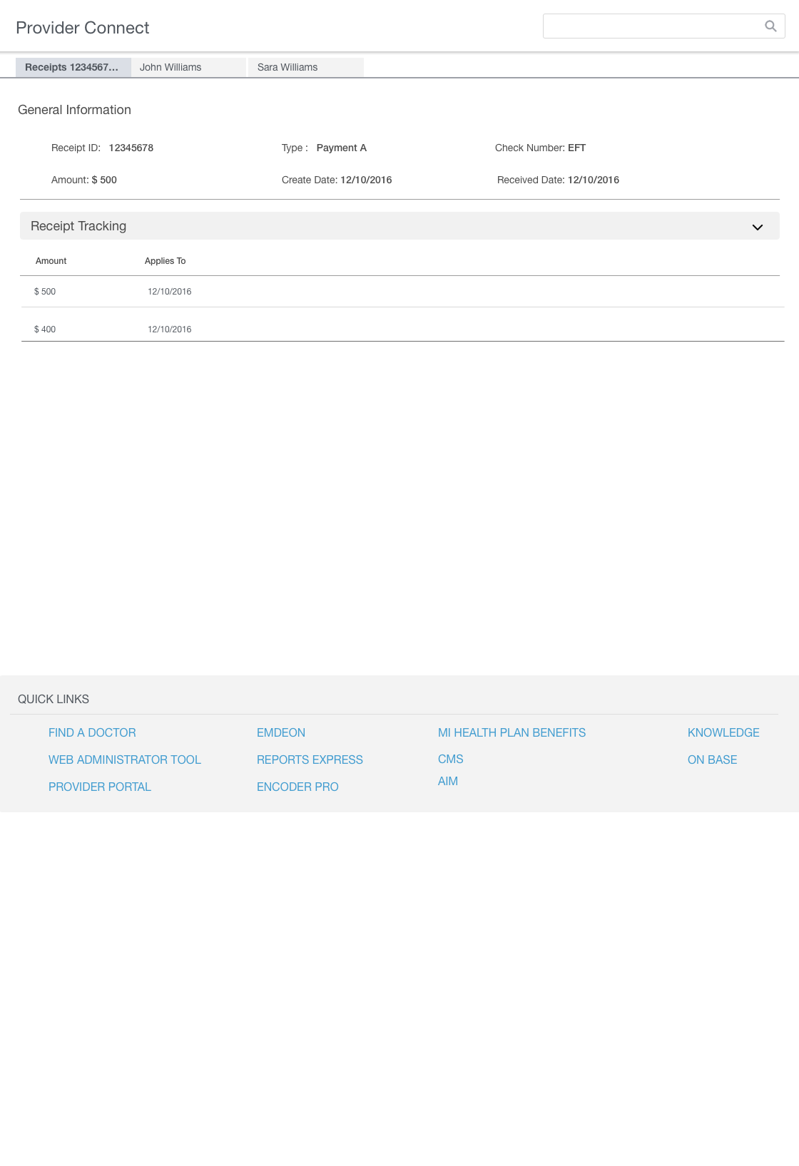
Wireframes for Billing and Payments module
